Starbucks Drinks Analysis - Power BI
- Ryan Deuter
- Apr 8, 2025
- 2 min read
Curious as to what drinks had the highest fat content and calorie content at Starbucks, I decided to delve into data using Power BI. The goal was to give custom formatting to have a sleek look that matched the color scheme of the brand itself. I learned a lot in this project as I did not follow templates or use AI- I used sheer exploration and the knowledge of courses taken on Power BI. Enjoy the exploration! And comment your favorite drink.
Link to Power BI file: https://github.com/ryandeuter/PortfolioProjects/blob/main/starbucks.pbix
BACKGROUND: Raw data dropped into Power BI to find insights into high calorie and high fat beverages available at the successful Starbucks coffee chain.
PROCESS: Data cleaning necessary in Power Query before being able to manipulate data for visualizations.

The data was transformed in Power Query. Data types were not right as all columns were imported as text values. Numeric columns were changed to whole number values.

Once these were changed, many Error values appeared in place of null values. "Replace values" under Transform was used to simplly convert them to 0. In this case further investigation into what appears to be missing data would be needed. However for the sake of dashboard creation and top calorie drinks, I did not deem them relevant due to their presumed low calorie and low fat content.
Next it was time to create a dashboard to check out KPIs such as highest calorie drinks, and highest fat drinks.
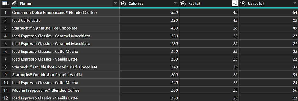
As there were almost 200 drinks on the list, I decided to put a filter on the first visual, the bar chart. I chose a top N filter in the filter pane, and filtered out by the top 5 drinks by highest calorie content.


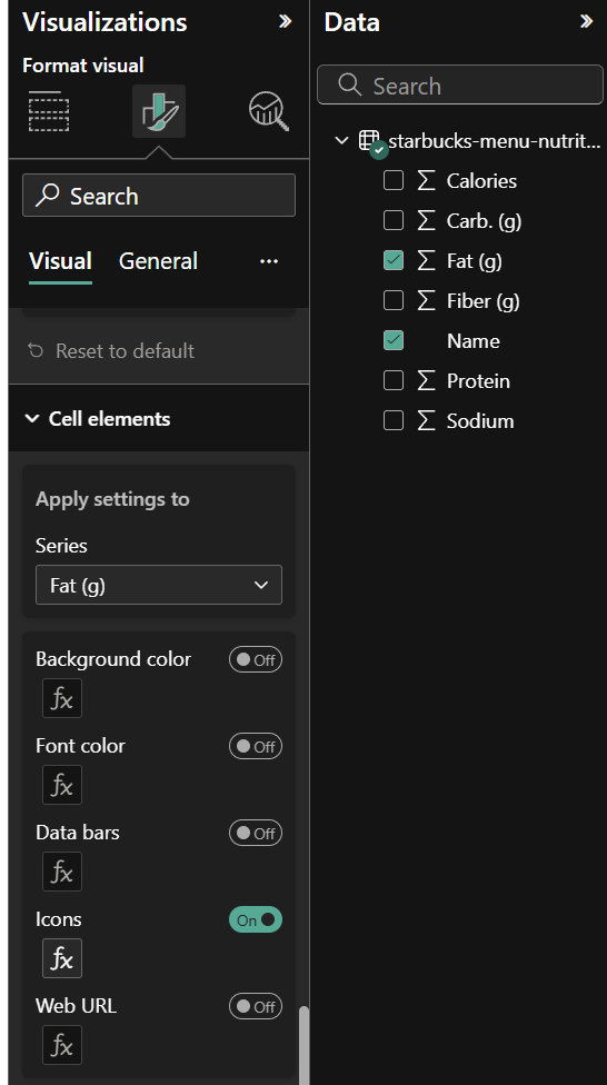
Next, I wanted to represent the data in a scrollable matrix visual. Custom data icons of ascending order of star rating were shown to represent fat content ratings. No stars is bad!

All in all, a lot of custom formatting went into this visual- fonts, backgrounds, wallpapers and more. The final product is meant to show, in a minimalist way, and with artistic simplicity, which drinks are highest in fat and calories at Starbucks.

Thanks for checking out this post, stay tuned as I delve into more data insights, with the aim of satisfying my curiosity and also amping up my skills in Power BI, SQL, and Python.


Comments